
Build a search bar with filter in React - Part 1
We will create in React (advanced) a search bar with filter. In this part we'll use MUI


We are going to create in React a search bar with checkboxes to select elements with a filter (interesting isn't it ? I know).
The final rendering can be tested on StackBlitz. 
The context
In one of my tasks in the company where I work, there is a form in which an administrator should assign features to users. He can select users, either type the name and select some or just group the users by their role. Basically it's a search bar with a filter and some other features. So I made a first implementation using Material UI which I will describe here.
The issue
Groupusers by anycharacteristicSelectsome usersFilterthe list of users based on different groupsExposethe list of selected users
The solution
Project configuration
Assuming you have node installed on your machine, we will :
- set up a small react + typescript project using vite
yarn create vite
- install MUI's dependencies
yarn add @mui/material @emotion/react @emotion/styled

yarn add @mui/icons-material
Then we create a components/SearchbarWithSelectAndFilter folder
and inside the latter, a SearchbarWithSelectAndFilter.tsx and types.ts file.
- For testing we will use a json already available here.
So you can get the dummy folder containing the file
data.json (stored in the constant
DummyData) and index.ts.
The first two points
Groupusers based on anycharacteristic.Selectcertain users
Material UI provides the component Autocomplete which is an input allowing the search in a list of elements that can be checked. So we have (make the necessary imports) :
component/SearchbarWithSelectAndFilter/SearchbarWithSelectAndFilter.tsx
const icon = <CheckBoxOutlineBlankIcon fontSize="small" />
const checkedIcon = <CheckBoxIcon fontSize="small" />
const SearchbarWithSelectAndFilter = () => {
  return (
    <div style={{ display: 'flex', alignItems: 'center', width: '500px' }}>
      <FormControl fullWidth>
        <Autocomplete
          fullWidth
          multiple
          disableCloseOnSelect
          limitTags={1}
          sx={{
            '& .MuiOutlinedInput-root': {
              padding: 0,
              height: 'auto',
            },
          }}
          options={DummyData}
          getOptionLabel={(option: DummyDataType) => `${option.firstName} ${option.lastName}`}
          renderOption={(props, option, { selected }) => (
            <li {...props}>
              <Checkbox
                icon={icon}
                checkedIcon={checkedIcon}
                style={{ marginRight: 8 }}
                checked={selected}
              />
              {option.firstName} {option.lastName}
            </li>
          )}
          renderInput={(params) => (
            <TextField {...params} placeholder={'Populations'} sx={{ paddingY: 0 }} />
          )}
        />
      </FormControl>
    </div>
  )
}
You will have noticed that the checkbox is rendered by the component and the prop we are interested in here are :
options which takes the array of data
Let's tell the truth, so far we just copied the MUI doc, thanks to them.
The filter component
Here it is just a MUI select box:
<FormControl sx={{ minWidth: '150px', marginRight: 1 }}>
  <Select displayEmpty size="small" inputProps={{ 'aria-label': 'Without label' }}>
    <MenuItem value="">Tout</MenuItem>
    {['JSBenin', 'PythonBenin', 'RustBenin', 'PHPBenin'].map((entity) => (
      <MenuItem key={entity} value={entity}>
        {entity}
      </MenuItem>
    ))}
  </Select>
</FormControl>
So a select with menu items inside listing the different values of the select.
Filtering
We are going to use the following image as a basis:
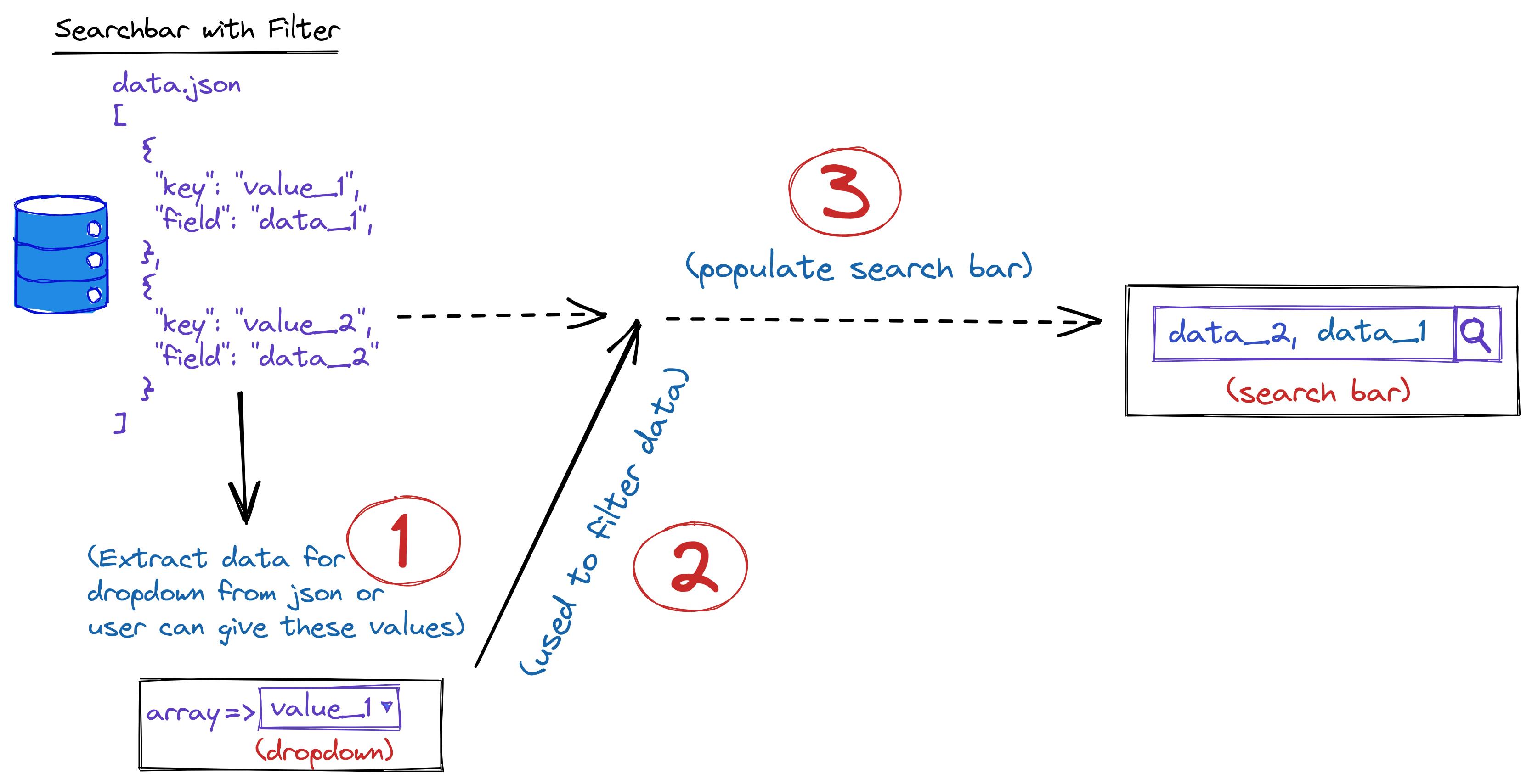
Extract the array for the dropdown
The user provides an array of data, we traverse it and we recover the values for the dropdown based on a callback that the user passes as props.
type SearchbarWithSelectAndFilterProps<T extends unknown> = {
    groupBy: (value: T) => string
    data: T[] | undefined
}

const SearchbarWithSelectAndFilter = (props: SearchbarWithSelectAndFilterProps) => {
   const {data, groupBy} = props;

   let itemsGroup = useMemo(() => {
   let itemsAsSet = new Set(data.map(groupBy));

   return Array.from(itemsAsSet).filter((v) => v !== undefined && v !== null);

   }, [data, groupBy]);

    return (
  {/** Rest of code here **/}
    )
}

{/* A use case */}
<SearchbarWithSelectAndFilter
        data={DummyData}
        groupBy={(value: DummyDataType) => value.teams.title}/>
Bottom line:
SetandgroupBy: we traverse the data array with amap, and with the callback (groupBy) passed in props, we can retrieve the list (values) to be provided to the dropdown. We pass it to aSetto remove duplicates values.Array: as the dropdown receives an array of options, we convert the set to an array which we store in itemsGroup.useMemo: to memorize this list (itemsGroup) and avoid doing this every time the component while the has not changed.
Provide data to dropdown and autocomplete
We already have the array (itemsGroup) to pass to the dropdown so in this step, we:
- store in a local state the item chosen in the dropdown and we handle category choosed.
- keep in a state of Map (key-value) the filtered list provided to autocomplete; where the key will be the selected
option from dropdown and the value will be the filtered list that we have after applying the
groupBycallback to data
I'm just showing the parts of the code involved.
{/*...some codes*/}

const [selectedItem, setSelectedItem] = useState(DEFAULT_SELECT_VALUE);
const [searchList, setSearchList] = useState(new Map<string, T[]>())

const handleSelectedItemChange = (event: SelectChangeEvent) => {
      setSelectedItem(event.target.value);
};

<Select
    {/*...*/}
    value={selectedItem}
    onChange={handleSelectedItemChange}
  >
    <MenuItem value={DEFAULT_SELECT_VALUE}>Tout</MenuItem>
    {
      itemsGroup.map(item => <MenuItem key={item} value={item}>{item}</MenuItem>)
    }
</Select>

<Autocomplete
    {/*...*/}
    options={searchList.get(selectedItem) ?? []}
/>

{/*...some codes*/}
Nothing new here: DEFAULT_SELECT_VALUE is just a default value you give to the dropdown
Group the data used by the autocomplete.
const [searchList, setSearchList] = useState(new Map<string, T[]>())

// update list of options provided to autocomplete
    useEffect(() => {
        const updateSearchList = new Map(searchList)
        if(!updateSearchList.has(selectedItem)) {
            if (selectedItem == DEFAULT_SELECT_VALUE) {
                updateSearchList.set(DEFAULT_SELECT_VALUE, data)
            } else {
                updateSearchList.set(
                    selectedItem,
                    data.filter((v) => groupBy(v) == selectedItem)
                )
            }
            setSearchList(updateSearchList)
        }
    }, [selectedItem, searchData])
Basically: with the useEffect, we update the autocomplete data only if dropdown option changed and if this value is not already a key of the Map
NB: For each dropdown value we could also filter the list at rendering time but I find that doing so can alter the performance of the component because it is possible that some options are not selected by the user
And now ?
So not much to go on 🤣. We put together components already created by MUI and we can shout everywhere that we have created a (very advanced) custom component: Super!!!. Before we finish, let's address two other points:
The props types of our new component and how to use it.
The props types of the search bar with filter
Let's take a look at this typing where I embed comments:
import { AutocompleteProps, CheckboxProps, FormControlProps, SelectProps } from '@mui/material'

export interface SearchbarWithSelectAndFilterProps<T extends unknown> {
  /**
   * Default placeholder used by textfield inside autocomplete
   */
  placeholder?: string

  /**
   * array of data used to make search
   */
  searchData: T[] | undefined

  /**
   * Function used as map callback to iterate over *sarchData* to get value for group field
   * @param value
   */
  groupBy: (value: T) => string

  /**
   * Function used to display custom data inside autocomplete
   * @param value
   */
  toDisplay: (value: T) => any

  /**
   * Main div container props
   */
  divProps?: ComponentPropsWithoutRef<'div'>

  /**
   * Select (used as dropdown) props
   */
  selectProps?: SelectProps<string>

  /**
   * First form control, parent of dropdown props
   */
  firstFormControlProps?: FormControlProps

  /**
   * Second form control, parent of autocomplete props
   */
  secondFormControlProps?: FormControlProps

  /**
   * Checkbox used inside autocomplete props
   */
  searchCheckboxProps?: CheckboxProps

  /**
   * Autocomplete props
   */
  autoCompleteProps?: AutocompleteProps<T, true, false, false>
}
The important thing to remember here is that for most of the components used I have created a props that contains all the possible attributes in order to make the customization of the component flexible. (A future article will be written about how I define my props to facilitate customization issues when several components are used).
What does the component look like?
Simple, we create a MUI file that will call the newly created component as follows:
src/views/MUI.tsx
import { DummyData, DummyDataType } from '../dummy'
import SearchbarWithSelectAndFilter from '../component/SearchbarWithSelectAndFilter/SearchbarWithSelectAndFilter'

const MUI = () => {
  return (
    <div>
      <SearchbarWithSelectAndFilter
        searchData={DummyData}
        groupBy={(value: DummyDataType) => value.teams.title}
        toDisplay={(value) => `${value.firstName} ${value.lastName}`}
        autoCompleteProps={{
          options: DummyData,
          renderInput: () => <></>,
        }}
      />
    </div>
  )
}

export default MUI
Retrieve the selected elements
After the component is created, we will be able to retrieve the list of selected elements (options). We will display the name and role of those that have been selected, and for this, we will use two new components, Card and Cards that you can get from the repository here: Card
Basically in the file src/component/Card/Card.tsx we have
import { DummyDataType } from '../../dummy'
import style from './Card.module.css'

export type CardProps = DummyDataType

const Card = (props: CardProps) => {
  return (
    <div className={style.card}>
      <div className={style.container}>
        <h4>
          <b>
            {props.firstName} {props?.lastName}
          </b>
        </h4>
        <p>{props.teams.title}</p>
      </div>
    </div>
  )
}

export default Card
then its css src/component/Card/Card.module.css
.card {
  box-shadow: 0 4px 8px 0 rgba(0, 0, 0, 0.2);
  transition: 0.3s;
  width: 150px;
  height: 150px;
  border-radius: 5px;
}

.card:hover {
  box-shadow: 0 8px 16px 0 rgba(0, 0, 0, 0.2);
}

img {
  border-radius: 5px 5px 0 0;
}

.container {
  padding: 2px 16px;
}
and in src/component/Card/Cards.tsx
import style from './Cards.module.css'
import { CardProps } from './Card/Card'
import Card from './Card'

export type CardsProps = {
  items: CardProps[]
}

const Cards = ({ items }: CardsProps) => {
  return (
    <div className={style.gridContainer}>
      {items.map((item, index) => (
        <Card key={index} {...item} />
      ))}
    </div>
  )
}

export default Cards
and that its css src/component/Card/Cards.module.css
.gridContainer {
  display: grid;
  grid-template-columns: auto auto auto;
  grid-template-rows: 80px auto 80px;
  column-gap: 20px;
  row-gap: 90px;
}
In Card, we display the information of each selected element and with Cards we display a list of Card
To retrieve the list of selected items, we will use a state that will be passed to the MUI autocomplete.
And if you had made the remark in the list of SearchbarWithSelectAndFilter props presented a little above,
it has an autoCompleteProps which inherits all the props of Autocomplete of MUI. Indeed, this props
is passed in destructured form to the Autocomplete component used as follows
<Autocomplete
  fullWidth
  multiple
  disableCloseOnSelect
  limitTags={1}
  {...autoCompleteProps}
  /// d'autres props
>
  {/* d'autres contenus */}
</Autocomplete>
In the Autocomplete props, there are value and onChange that we will use.
We will use the MUI component created above.
src/views/MUI.tsx
import { DummyData, DummyDataType } from '../dummy'
import SearchbarWithSelectAndFilter from '../component/SearchbarWithSelectAndFilter/SearchbarWithSelectAndFilter'
import Cards from '../component/Card/Cards'
import { useState } from 'react'

const MUI = () => {
  const [selectedOptions, setSelectedOptions] = useState<DummyDataType[]>([])

  // console.log(selectedOptions)

  return (
    <div>
      <SearchbarWithSelectAndFilter
        searchData={DummyData}
        groupBy={(value: DummyDataType) => value.teams.title}
        toDisplay={(value) => `${value.firstName} ${value.lastName}`}
        autoCompleteProps={{
          options: DummyData,
          renderInput: () => <></>,
          value: selectedOptions,
          onChange: (_event, value) => setSelectedOptions(value),
        }}
      />
      <br />

      <Cards items={selectedOptions} />
    </div>
  )
}

export default MUI
- We create a state
[selectedOptions, setSelectedOptions]that keeps the selected list - We pass to the value and onChange props of Autocomplete respectively selectedOptions and a function
that updates setSelectedOptions. This is done using the
autocompletePropsprop of ourSearchbarWithSelectAndFilter. - We then pass this list (selectedOptions) to
Cards.
The result is something like this:
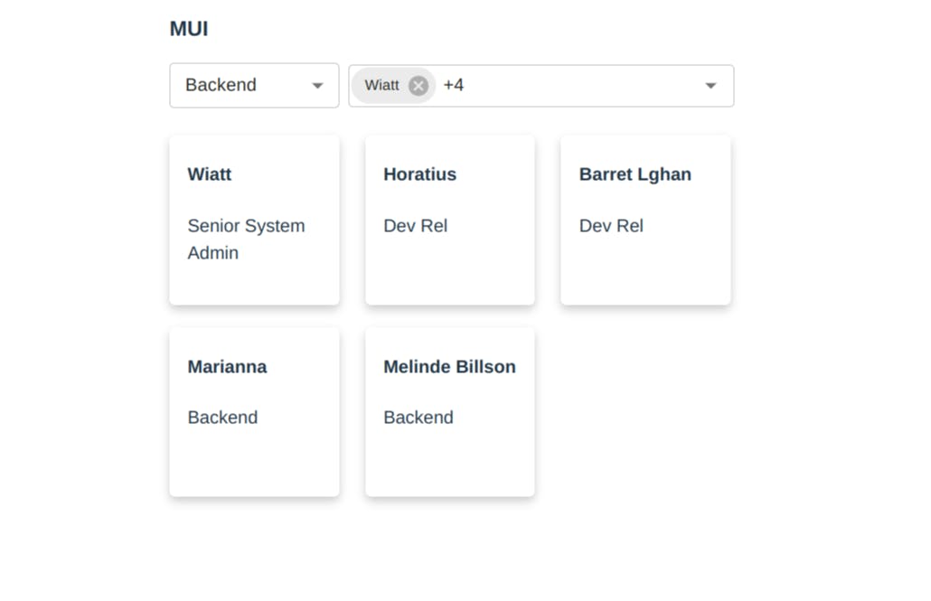
Great.
Conclusion
Finally, we are at the end. I admit that it is a little long this part 🤧. The documentation of MUI being rather
well provided, our job was to write functions that allow to group and filter the data for the
dropdown and autocomplete.
This raises the following issues which will be discussed in next parts:
- How to make the component more flexible, for example by allowing the choice to have uncategorized options (undefined or null)
- How to extract the logic from the component so that it can be reused with MUI as well as other UI libraries like Mantine or Ant Design?
- How to write test for our component ?
The complete code is available here
and on my Github.
So
I share a few tips that I use in my daily tasks, and I hope you have others that you want to share with us. I'm open to tips, and my social accounts are there for that.
So can you smell what Tawaliou is cooking ?